CSS Layout techniques
Contents
Intro to CSS
What is CSS?
Cascading Style Sheets say how your HTML looks like.
- "This element…"
- "… or these elements…"
- "… should look like this"
These are CSS rules.
Give me examples of CSS rules
p {
  color: pink;
  font-weight: bold;
  margin-left: 2em;
}
What is a selector?
The selector defines which element(s) the rule is
applied to.
There are 3 types:
- Selecting all elements of a particular
type, e.g.
p {}orp strong {} - Selecting multiple elements by using a
class, e.g.
.warning {}orp.warning {} - Selecting one element by using an unique
id, e.g.
#about {}
CSS Selector Reference
Best practice
Start with generic styles on elements and get more specific with classes and ids.
- Find first the similarities in your design (=generic) and
- afterwards the differences (=specific).
What is a declaration?
The selector is followed by a block of
one or more declarations. The block starts and ends
with the opening and closing curly brackets
{ }.
Inside the block each declaration consists of the name of a property, a colon, and the value for the property. And at the end there is a semi-colon.
color: red;
Recap: CSS rule
selector {
  property_1: value_1;
  property_2: value_2;
  property_3: value_3;
  ...
}
The block { } is called
declaration.
Best practice
Always use the same structure / order inside a rule, e.g.
- go by alphabet:
colorbeforewidth - go by type: group colors together, styles of font-styling, e.g.
font-size, then block-styling, e.g.heightandwidth - merge both or find your own structure
Best practice
* {
  color: black;
  font-family: Arial, sans-serif;
  font-size: 1em;
}

h1 {
  color: pink;
  font-family: Georgia, serif;
  font-size: 3em;
}
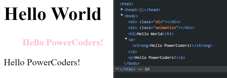
What does that mean?
p, strong {
  color: pink;
  font-weight: bold;
  margin-left: 2em;
}
And this?
p strong {
  color: pink;
  font-weight: bold;
  margin-left: 2em;
}
How can you build a basic layout in CSS?
- Flex
- Grid
- Multi columns
- Float
Example Grid
.parent {
  display: grid;
  place-items: center;
}
Example Flex
.parent {
  display: flex;
}

.child {
  flex: 0 1 150px;
}
Tell me some properties and what they do?
How do you connect your CSS with your HTML?
In 3 ways
- External
- Embedded (or internal)
- Inline
Connecting CSS to HTML: External
<head>
  <link rel="stylesheet" href="style.css">
</head>
- Can be referenced from multiple pages.
- Reduced file size & bandwidth.
- Easier to maintain in larger projects.
Connecting CSS to HTML: Embedded
<head>
  <style>
    p {
      color: blue;
      font-size: 12px;
    }
  </style>
</head>
- Inside
<head>element. - Uses
<style>tag. - Only applies to that page.
Connecting CSS to HTML: Inline
<p style="color:red">Some text.</p>- Uses the HTML
styleattribute. - Only applies to one element at a time.
- Not recommended to use.
Best practice
Use external css files.
- order rules from big to small
- order rules from the outside to the inside
- add comments and whitespace
Best practice
/* always declare html element first - it's the biggest */
html {
  background : #ffffff;
  box-sizing: border-box;
  font-size : 10px;
  /*font-size : 0.75vw;*/
  line-height : 1;
  height : 100%;
  scroll-behavior: smooth;
  overflow-x : hidden;
  width : 100%;
}

/* This selects ALL elements. Add it AFTER the html selector */
* {
  color : #333333;
  font-family : Helvetica, Arial, sans-serif;
  font-weight : 400;
  font-size : 2rem;
  font-smooth : always;
  line-height : 1.47;
  margin : 0;
  padding : 0;
  outline : 0 !important;
  text-align : left;
  scroll-behavior: smooth;
}

/* from big to small: body selector is next, followed by header, main... */
body {
  min-height : 100%;
  min-height: 100vh;
  height : auto;
  position : relative;
  overflow : hidden;
  width : 100%;
}

/* group rules together, e.g. all text rules */
h1 {}
h2 {}
p {}
strong {}
a {}
CSS Cascade
What is Cascading?
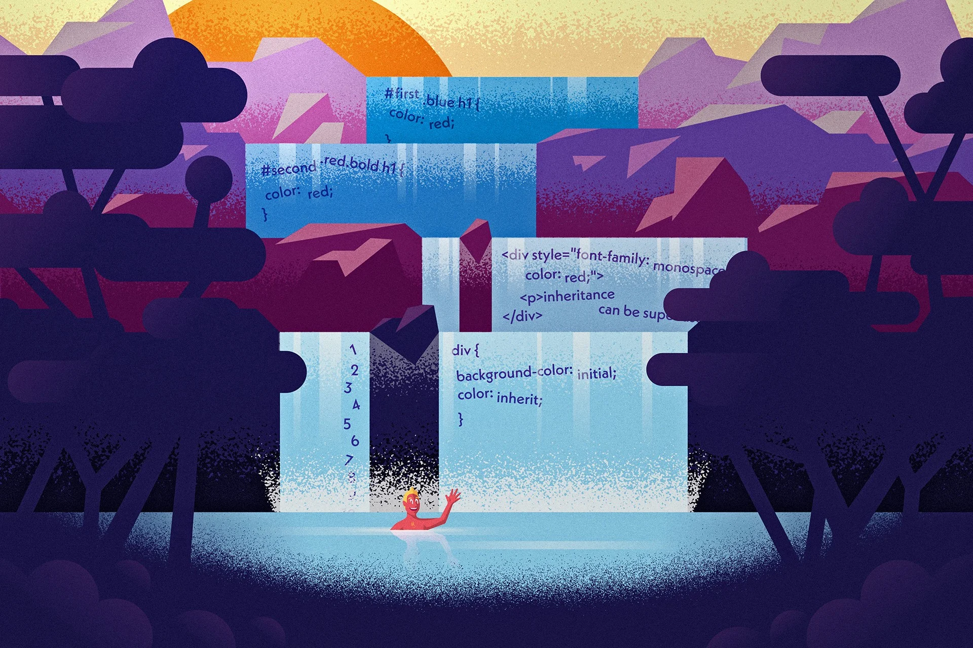
The CSS Cascade is the way our browsers resolve competing CSS declarations.
Every time we add a CSS rule, it enters the CSS cascade.
The further down the cascade a declaration falls, the less likely it will end up as the final style.

Importance
The first tier of the Cascade looks at the type of rule
- transition: Rules that apply to an active transition take the utmost importance
!important: When we add !important to the end of our declaration, it jumps to this level of the Cascade. Ideally, you reserve this to override styles from third-party libraries.- animation: Rules that apply to an active animation jump up a level in the Cascade
- normal: It is at this level that most of the rules are found
Which rule would win?
p {
  color: orchid !important;
}

... [many rules in between] ...

p {
  color: sandybrown;
}Remember that
!important declarations fall on
the second level, while normal declarations fall on the fourth
level.
Origin
The second tier of the Cascade looks at where the rule was defined
- Author stylesheets: This is the only level that you have control over, as a web developer.
- User stylesheets: The user can change styles via browser settings or Code Inspector.
- Browser stylesheets: Each browser has its own
set of styles called
user agent stylesheet.
Reference
Specificity
The third tier of the Cascade looks at the Specificity of a rule.
- inline: Styles declared within a
styleHTML property are the most specific - id: Targeting elements based on their
id, using the syntax
#id - class, attribute or pseudo-class: Targeting
elements based on their class, using the syntax
.class
This level also includes attribute selectors that target HTML attributes, like[checked]and[href="https://powercoders.org"], and pseudo-selectors, like:hoverand:first-of-type - type or pseudo-element: Targeting elements based
on their tag type, using the syntax
type, e.g.p {}
This level also includes pseudo-elements, like::beforeand::selection
Pseudo-class vs pseudo-element
A pseudo-class is used to define a special state of an element.
A pseudo-element is something that acts like an element, but is not an element. Thus, it cannot be manipulated by JavaScript.
ReferenceFight time: Which rule wins?
A
<p style="color: sandybrown">...</p>B
p {color: orchid;}Fight time: Which rule wins?
A
.paragraph {color: sandybrown;}B
#paragraph {color: orchid;}The number of hits matter
A
.paragraph:first-of-type {color: sandybrown;}B
p.paragraph {color: orchid;}Lower level counts if number of hits match
A
p#paragraph {color: sandybrown;}B
#paragraph.paragraph {color: orchid;}Position
The fourth and final tier looks at the order that the rules were defined in.
Rules lower in the file overwrite rules higher in the file
p {
  color: sandybrown;
}
p {
  color: orchid;
  color: black;
}
CSS Cascade: summary
There are four tiers in the cascade. The further down the cascade a declaration falls, the less likely it will end up as the final style.
- Importance
- Origin
- Specificity
- Position
CSS reset / normalize
In order to deal with different browser styles people came up with stylesheets which would reset these styles or normalize them.
Even with reset or normalizing stylesheets in place, browser testing is mandatory.
CSS colors and quick color theory
CSS Color Values
Your browser can accept colors in many different ways:
| Color name: | red |
| Hexadecimal value: | #FF0000 |
| RGB value: | rgb(255, 0, 0) |
| RGBA value: | rgba(255 0 0 / 1) |
| HSL value: | hsl(0°, 100%, 100%) |
| HSLA value: | hsla(0° 100% 100% / 1) |
Best practice
- hex codes
- rgba
- hsla
Quick color theory
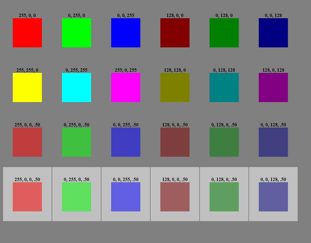
- RGBA = Red, Green, Blue, Alpha
- R, G, B in range [0 - 255]
- 0 = none of that color
- 255 = maximum amount of that color
- Alpha in range [0.0 - 1.0]
- 0.0 = completely transparent, 0% of the color
- 1.0 = completely opaque, 100% of the color
- 0.5 = 50% of the color
- 0.25 = 25% of the color, etc
Color examples
Quick color theory
- Hexadecimal codes are also based on RGB
- RGB in range [00 - FF]
- 00 = none of that colour
- FF = maximum amount of that color
- There is no transparency possible with hex codes
Examples:
- #FFFFFF - white
- #0000FF - blue
- #FF0000 - red
- #00FF00 - green
- #000000 - black
Quick color theory
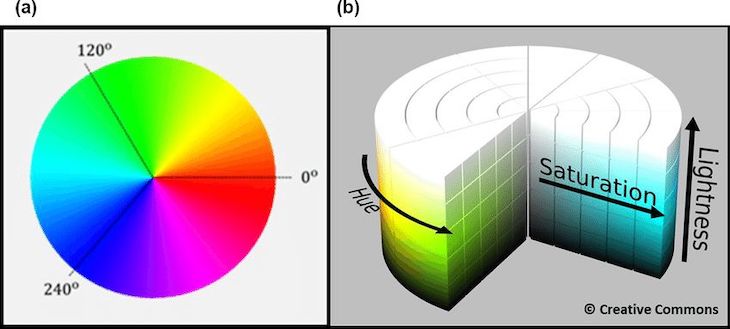
- HSLA = Hue, Saturation, Lightness, Alpha
- H in range [0 - 360deg]
- S and L in range [0 - 100%]
- Alpha in range [0.0 - 1.0]
- 0.0 = completely transparent, 0% of the color
- 1.0 = completely opaque, 100% of the color
- 0.5 = 50% of the color
- 0.25 = 25% of the color, etc
HSL diagram
HSL(A) is most flexible
If your color scheme works with different variations of the same hue (=color), use hsl(a):
--clr-accent-hue: 34;
--clr-primary: hsl(var(--clr-accent-hue) 88% 54%);
--clr-primary-light: hsl(var(--clr-accent-hue) 88% 75%);
CSS color properties
colorbackground-colorborder-colortext-decoration-color- …
Best practice
- Use only a few colors. Usually 1 text color, 1 link color (plus 1 hover), 1 highlighting color.
- Use colors in a logical way, e.g. not the same color for link (with action) and highlight (without action).
- Let them be readable for anyone and choose a good contrast between text and background.
Coolors.co
CSS fonts
CSS fonts
- CSS gives a lot of control over the appearance of text
- Collectively, these are the
font-*properties.
CSS fonts
font-family
<!DOCTYPE html>
<html>
<head>
  <style>
      h1.serif { font-family: serif; }
      h1.sans { font-family: sans-serif; }
      h1.mono { font-family: monospace; }
    </style>
  </head>
  <body>
    <h1 class="serif">This is serif</h1>
    <h1 class="sans">This is sans-serif</h1>
    <h1 class="mono">This is monospace</h1>
  </body>
</html>
Serif fonts
Serif fonts are called that because they have the little sticking out bits at the ends of bits of the letters. For example, at the left and right ends of the top of the T.
Sans-serif fonts
Sans-serif literally means "without serifs" – as you can see in the second heading these letters have no sticking out bits.
Monospace fonts
And monospace fonts might be serif or sans-serif. Their main characteristic is that all the letters are the same width.
Default fonts
The browser defines the default fonts.
- chrome://settings/fonts
a font stack
body {
  font-family: 'DejaVu Serif', 'Times New Roman', Times, serif;
}

h1, h2, h3, h4, h5, h6 {
  font-family: 'DejaVu Sans', Arial, Helvetica, sans-serif;
}

pre, code, tt {
  font-family: 'DejaVu Sans Mono', monospace;
}
What is a font stack?
You can list multiple fonts for a
font-family entry. This is called
a font stack.
When the browser sees a font stack, it checks to see if the first font in the list is installed on the user's computer. If it is, it uses it.
If it's not, it moves on to the next font in the list. So you should list the fonts in the stack from most specific to least specific.
"Web safe" fonts
| Names / Font stack | Type |
|---|---|
Helvetica, Arial
|
sans-serif |
Courier New, Courier
|
monospace |
Georgia
|
serif |
Times New Roman, Times
|
serif |
Verdana
|
sans-serif |
Downloadable web fonts
@font-face {
  font-family: 'Open Sans';
  src: local('OpenSans Regular'),
       url('/fonts/OpenSans-Regular-webfont.woff2') format('woff2'),
       url('/fonts/OpenSans-Regular-webfont.woff') format('woff');
}
Google Fonts
One of several online repositories of free fonts that make it very easy to include them in web pages
Try to find the Lato font & include it in your page
<link href="https://fonts.googleapis.com/css?family=Lato" rel="stylesheet">Fonts best practice
- Always use font stacks
- Only use 1-2 different fonts per website
- Use monospace for
code
Icon fonts
Icon fonts are text files that can be modified using CSS.
Pro:
- Scale better than images
- Change color, size etc. via CSS
Con:
- Additional request to server
- Flash of invisible icons while font is loading
- Some browser might not be able to interpret the font
CSS images format
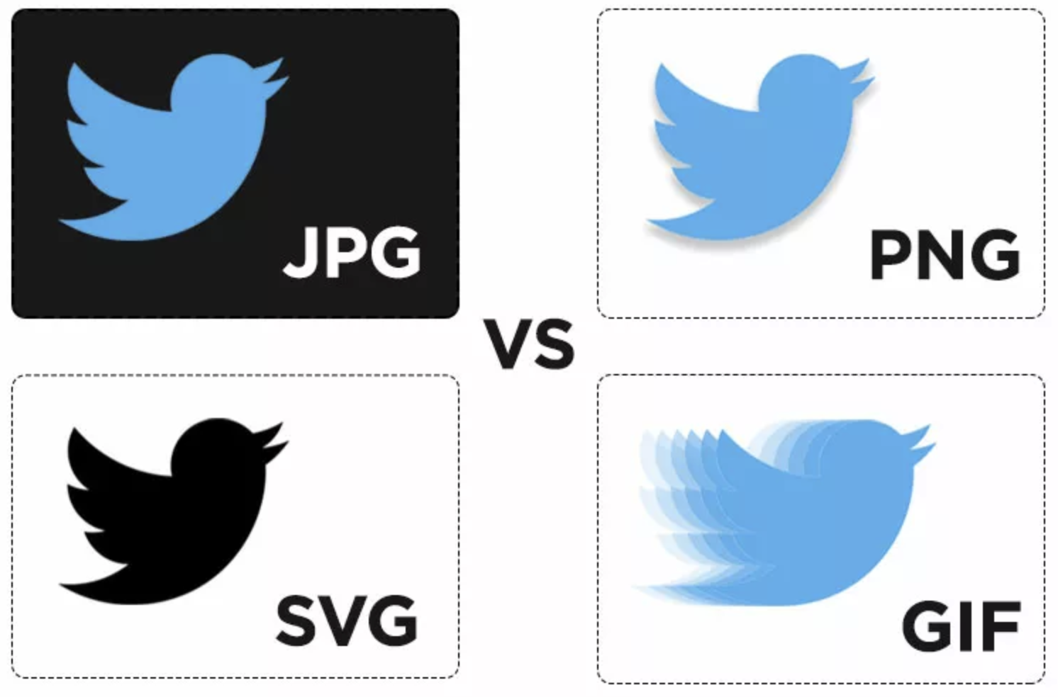
SVG
... stands for Scalable Vector Graphics.
- Best responsive image choice, as it can infinitely scale.
- Possible to use CSS and Javascript (JS) to interact with SVG.
- Mainly used for icons, logos and infographics.
- Stores math-equations that create the image
It is both an image format and a document format. There’s so much possible with it.
SVG
Some drawbacks...
- Not ideal for realism
- Larger files size with complex designs
- SVG files have to be created by hand

The future of icons
SVGs are quickly becoming the new standard of web icons and animations.
They offer
- superior scaling
- faster rendering than icon fonts
- smaller file size than jpg or png
- better accessibility
- extensive customization
font-size
font-size sets the height of the font.
default font-size in the browser is set to 16px
16px = 1em
Measurement units
pt: Points are a fixed unit, from the printing era. 1 pt = 1/72 of an inch. Only used for letter-spacing or word-spacing.px: Pixels are a fixed unit. 1 Pixel is the smallest unit of a digital image that can be displayed.%: Percentage is a scalable unit and calculates the size based on the default 16px (= 100%).em: Scalable unit and calculates the size based on the default 16 px (= 1em). The em takes the width of the M as base.rem: Scalable unit similar toem. The r in rem stands for root. The rem unit is relative to the root (html) element.vw / vh: Scalable unit based on viewport width / height. More used for block-level elements than text.- ... and more, e.g.
ch
em versus
rem
Try it yourself
- Add a new section to a HTML file
- Add several paragraphs within the section
- Emphasise some text as
strongoremin each paragraph - Set the section font-size to 1em
- Set each paragraph to a different font-size in em
- What happens?
Now change em to rem. What changes?
font-weight
says how bold the text should be
strong {
  font-weight: bold; /* Default */
  font-weight: 700; /* Default */
}
strong {
font-weight: normal; /* Disabled bold */
font-weight: 400; /* Disabled bold */
}font-weight
says how bold the text should be
.bolder {
  font-weight: bolder; /* bolder than bold */
  font-weight: 800; /* bolder than bold */
}
.lighter {
font-weight: lighter; /* less bold */
font-weight: 200; /* less bold */
}font-style
used for italic variations, rare
em {
  font-style: italic; /* Default */
}
em {
font-style: normal; /* Disabled italic */
}em {
font-style: oblique; /* simulates italic */
}line-height
- defines the extra space around each line
- Gives the text some "breathing room"
- Value is a multiplier of the font-size
body {
  font-height: 1.45;
}
font shorthand
p {
  font: italic normal bold normal 3em/1.5 Helvetica, Arial, sans-serif;
}
p {
font-style: italic;
font-variant: normal;
font-weight: bold;
font-stretch: normal;
font-size: 3em;
line-height: 1.5;
font-family: Helvetica, Arial, sans-serif;
}CSS background
Background properties
background-color: lightblue;background-image: url("img_tree.gif");background-position: 0 0;background-size: cover;background-repeat: no-repeat;background-origin: content-box;background-clip: content-box;background-attachment: fixed;
background: lightblue url("img_tree.gif") no-repeat fixed center
              / cover;
Multiple backgrounds
You can add multiple backgrounds as layers on top of each other by adding them in one line, seperated by comma.
background-color: white;
background-image:
 linear-gradient(45deg, black 25%, transparent 25%, transparent 75%, black 75%),
 linear-gradient(45deg, black 25%, transparent 25%, transparent 75%, black 75%);
background-size:100px 100px;
background-position: 0 0, 50px 50px;
Animated backgrounds
body {
 width: 100%;
 height: 100vh;
 background: linear-gradient(-45deg, #ee7752, #e73c7e, #23a6d5, #23d5ab);
 background-size: 400% 400%;
 animation: gradientBG 15s ease infinite;
}

@keyframes gradientBG {
 0% {
  background-position: 0% 50%;
 }
 50% {
  background-position: 100% 50%;
 }
 100% {
  background-position: 0% 50%;
 }
}
Comments
HTML comment
<!-- This is a comment -->
CSS comment
/* This is a comment */
Comments can be used to organize your code into sections so you (or someone else) can easily understand your code. It can also be used to 'comment out' large chunks of code to hide it from the browser.
Online resources
Online Resources: Images and Patterns
Online resources: Web fonts
Document flow
It's all about the flow
Document flow is the arrangement of page elements, as defined by CSS positioning statements, and the order of HTML elements.
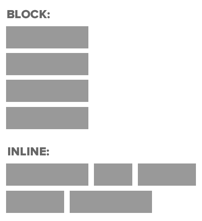
Regarding the order of the HTML elements, their definition as inline or block-level element defines the space they take up in the document.
Document flow = how each element takes up space and how other elements position themselves accordingly.
Flow of HTML elements
display
defines how an element is displayed. You can turn block-level elements to inline and vice verse.
a {
  display: block; /* block-level element */
}
h1 {
display: inline; /* inline element, will break at end of line */
}display
defines how an element is displayed. You can turn block-level elements to inline and vice verse.
li {
  display: inline-block; /* appears inline, does not break across lines */
}
#footer {
display: none; /* hidden */
}display: inline-block
Block-level elements are stacked underneath each other in one column.
Changing their display-property to
inline-block results in a row of these
elements.
Is the maximum width of the parent (wrapping) container reached, the elements will automatically wrap into a new line.
Tipps when using inline-block
inline-block elements need to have a
width defined.
Use vertical-align to make sure that the elements are
aligned properly in one row.
When two elements with display: inline-block are
sitting next to each other, whitespace between them becomes a space
character. Remove the whitespace.
Box model
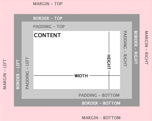
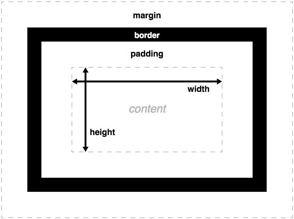
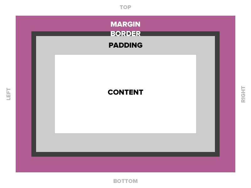
What is the box model?
The box model is used to describe an element's dimensions and structure. It is made up of four boxes:
- content box
- padding box
- border box
- margin box
Default box rules
widthis the width of the content areaheightis the height of the content areabackgroundproperties apply to padding as well as contentpaddingadds to the total size of the box- Like padding,
borderadds to the total size of the box
Calculating the total height and width of elements can be difficult. Especially for responsive websites.
box-sizing: content-box
Default box rules apply
The total height of an element is the sum of
- content height
- plus padding-top and -bottom
- plus border-top and -bottom
The total width of an element is the sum of
- content width
- plus padding-left and -right
- plus border-left and -right
box-sizing: border-box
Best practice to use always this value
- The total height of an element is identical to the content height including padding and border.
- The total width of an element is identical to the content width including padding and border.
Set border-box once on html selector and inherit for all other elements.

Best practice
html {
  box-sizing: border-box;
}

*, *:before, *:after {
   box-sizing: inherit;
}
Why not?
* {
box-sizing: border-box;
}
Some 3rd party plugins / components might require content-box model. With the best practice solution you ensure that those plugins will still be styled correctly.
margin
Four values: 10px on top, 5px on right, 3px on bottom, 5px on left
margin: 10px 5px 3px 5px; /* clockwise order: top right bottom left */Two values: 10px top and bottom, 15px left and right
margin: 10px 15px; /* top/bottom right/left */One value: 15px on all side
margin: 15px;One side: 10px only on top
margin-top: 10px;margin: auto
If a margin is set to auto on a box that has a given width, it will take up as much space as possible.
Centered
margin: auto;
width: 50%;
Flush right
margin-left: auto;
margin-right: 0.5rem;
width: 50%;
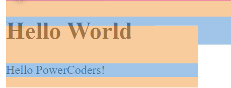
Margin collapse
Collapsing margins happen when two
vertical margins come in contact with one another.
If one margin is greater than the other, then that
margin overrides the other, leaving
one margin.
This happens in these 3 cases:
- Adjacent sibling elements: sharing the same parent
- Parent and first / last child
- Empty blocks
An example
<body>
  <h1>Title</h1>
  <p>Paragraph</p>
</body>
h1 {
margin-bottom: 25px;
}
p {
margin-top: 50px;
}
You would expect 75px, but instead you get
50px margin between the h1 and the
p.
It's like the bigger margin ate the smaller one:
bigger margin = total vertical margin
Negative margin
h1 {
  margin-bottom: -25px;
}

p {
  margin-top: 50px;
}
50px + (-25px) = 25px
If one margin is negative, the negative margin is subtracted from
the positive margin, reducing the total vertical margin.
If both margins are negative, the bigger negative margin eats the
smaller one:
bigger negative margin = total negative vertical margin
padding
Four values: 10px on top, 5px on right, 3px on bottom, 5px on left
padding: 10px 5px 3px 5px; /* clockwise order: top right bottom left */Two values: 10px top and bottom, 15px left and right
padding: 10px 15px; /* top/bottom right/left */One value: 15px on all sides
padding: 15px;One side: 10px only on top
padding-top: 10px;
*background properties apply to padding as well as
content.
border
Borders are specified as "thickness, style, color."
You can
specify each property separately, or all three together.
border: 1px solid #ff0000;border-top: 4px dotted #000000;border-width: 10px;
border-style: dashed;
border-color: #666666;CSS positioning
position: static
- Initial value to all elements
- Static positioned element stay in-flow
position: relative
- Relative positioned element stay in-flow, but interact with out-of-flow elements.
- It acts as the container for out-of-flow children. The children respect the box boundaries of the relatively positioned element.
- The content of a relative positioned box can be shifted out-of-flow by offset properties: top, right, bottom, left.
position: absolute
- Absolute positioned element is removed from the flow entirely = out-of-flow element.
- Their position is assigned to the first parent element, which has a non-static position (relative, absolute, fixed or sticky).
- The offset properties (top, right, bottom, left) are based on the top left corner of that parent.
- Each absolute positioned elements get its
own layer. You can stack the layer with the CSS
property
z-index.
position: fixed
- Fixed positioned element is removed from the flow entirely = out-of-flow element.
- It is assigned a position to the viewport (browser window) and creates a new layer.
- The offset properties (top, right, bottom, left) are based on the top left corner of the viewport.
position: sticky
- Mix between relative positioned element and fixed positioned element.
- It acts like relative positioned until it is scrolled beyond a specific offset, then it turns to fixed position.
- Can I use position sticky?
Tricky sticky
- If any parent/ancestor of the sticky element has any of the
following overflow properties set, position: sticky won't work:
hidden,auto,scroll - If the parent element has no
heightset then the sticky element won't have any area to stick to when scrolling. This happens because the sticky element is meant to stick/scroll within the height of a container.
float
- A float is a box that is shifted to the left or right on the current line.
- Content flows around the shifted box, down the right side of a left-floated box and vice verse.
- Floated elements are out-of-flow. The parent container loses its content height and width.
Floated elements are still often used for typical website
layouts.
DO NOT USE THEM.
Clearfix
Is used to solve the parent height problem of floated elements
.clearfix:before,
  .clearfix:after {
    content:"";
    display:table;
}

.clearfix:after {
  clear:both;
}

.clearfix {
    *zoom:1;
}
Tipps when using float
Use the .clearfix snippet to ensure the parent element
takes up enough space in the document flow.
Use clear if you want following elements to move below
the floated element.
CSS Flexbox
display: flex
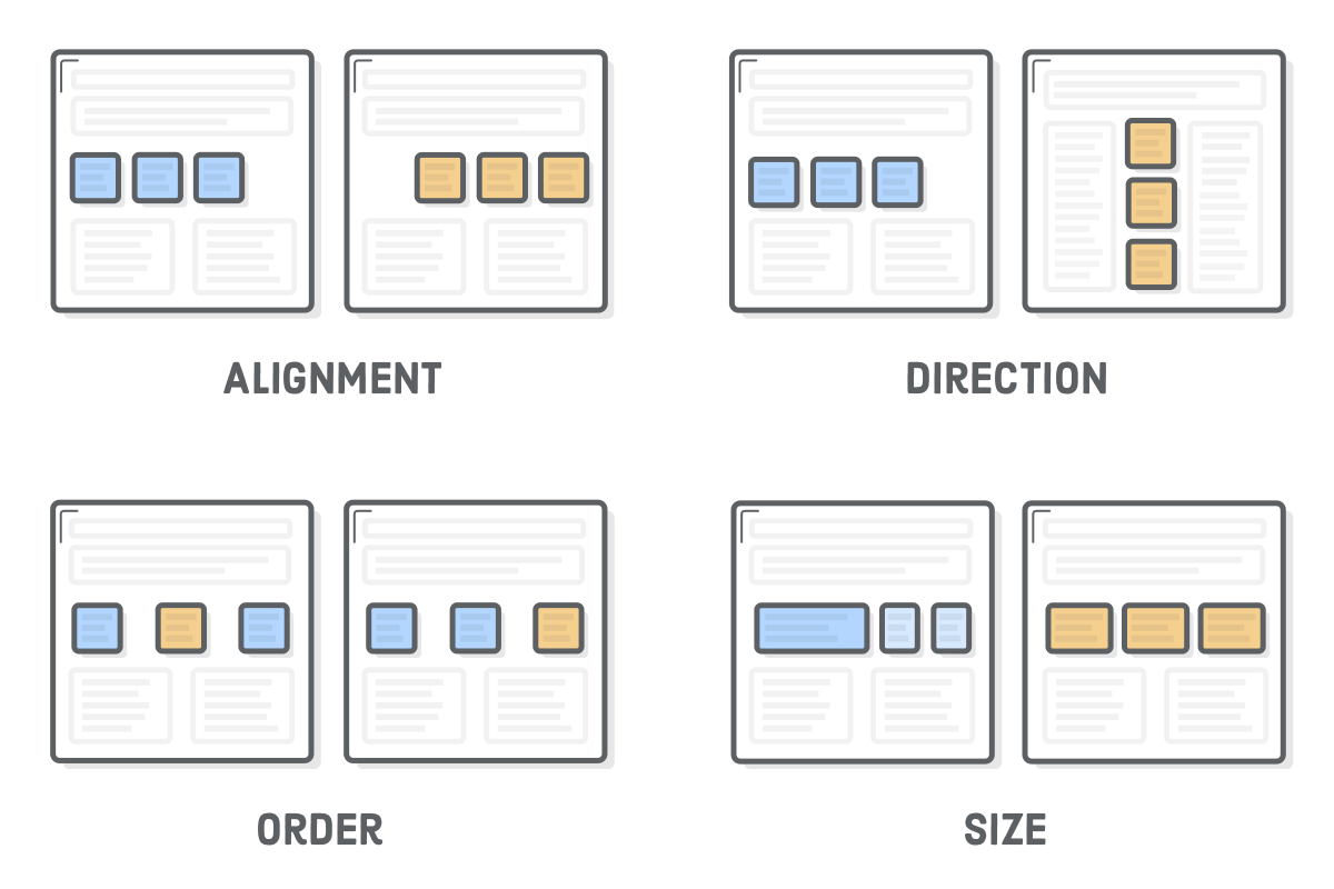
- Use
display: flex;to create a flex container. - Use
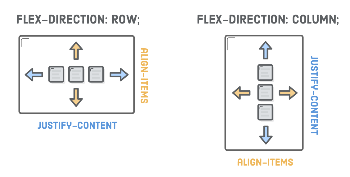
justify-contentto define the horizontal alignment of items. - Use
align-itemsto define the vertical alignment of items. - Use
flex-directionif you need columns instead of rows. - Use the
row-reverseorcolumn-reversevalues to flip item order. - Use
orderto customize the order of individual elements. - Use
align-selfto vertically align individual items. - Use
flexto create flexible boxes that can stretch and shrink.
Flexbox is an easy way to create responsive websites as scalability is built-in.
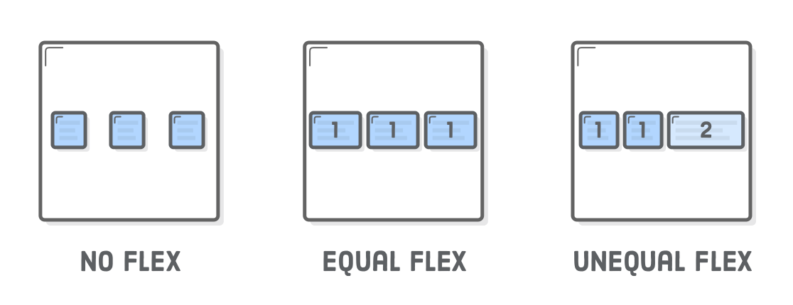
Flexible containers
With the property flex on the items you have the first
step for a responive website.
Tipps when using flex
Depending on the flex-direction the properties
justify-content and
align-items switch meaning.
Flexbox Froggy
Interactive game to practice flex
CSS Grid
It is the latest CSS layout technique.
All
major web browsers
support it though, so use it.
- Use
display: grid;to create a grid container. - Items are placed in rows by default and span the full width of the grid container.
- Use
grid-template-rowsto define the number (and height) of rows. - Use
grid-template-columnsto define the number (and width) of columns. - Use
grid-gaporgrid-row-gap/grid-column-gapto define the gutter between grid items.
display: grid
- Use
frunit to create flexible grid tracks. It represents a fraction of the available space in the grid container. - You can combine
frunits with other units like px, em or %. - Use
grid-row-startandgrid-row-endaccordingly. - Use
grid-template-areasto define names for your grid, e.g. header, content, sidebar and footer. - Place the items in the grid by using
grid-column-startandgrid-column-end. - Auto-place items by using
grid-auto-rows,grid-auto-columnsandgrid-auto-flow. - Use
justify-itemsandalign-itemsto align the items inside your grid.
Grid vs Flex: When to use which?
- Grid puts layout first: structure and predictability
- Flex puts content first: more flexibility
It is not one or the other. Mix them, use them both.
CSS Multi columns
Newspaper-style columns, often used as fallback for
flex and grid layouts or for masonary-like
layouts (like pinterest).
- Use
column-countto define the number of columns. - Use
column-widthto define the width of each column. - Use
column-gapto define the gutter/margin between the columns. - Use
column-ruleto display a vertical line between the columns. - Use
column-spanon child elements you want to span all columns. - Use
break-insideand similar properties on children to control content breaks.
Reference sheets
Online resources for CSS Grid
Online resources
Responsive by default
flex, grid and multicol are
responsive by default.
Using one or more of these layout techniques will make your website reponsive already.
Media queries
CSS module that enables content to adapt to screen resolutions and sizes.
A media query consists of a test, followed by as many CSS rules as we want, with the rule block enclosed in a set of braces. If the test condition is false, the browser simply ignores the rule block and moves on.
A media query can be used to check for a particular condition such as the width and height (of the browser window), device width and height, orientation or resolution.
Example
@media screen and (min-width: 50em) { … }- Media Type (example: screen) declares what type of of media the rules should be applied to. There are four options you can declare: all, print, screen, and speech.
- Expressions (example: (min-width: 50em) targets devices based on specific conditions, like min-width, max-width, device-pixel-ratio and more.
- CSS Rules are defined inside the curly brackets and only apply when media tpye and expressions both return True.
Breakpoints
Media queries are used to define breakpoints for today's Reponsive design:
- Best practice is to start with mobile first
- Add min-width media queries for breakpoints
- Add as few as possible and use custom ones
Device-specific breakpoints
... are used to target specific devices, e.g. iPhone 6+,
iPhone
X or Samsung Galaxy S3.
Today there are hundreds of different phones of several generations.
With different screen sizes, resolutions and ratios.
Device-specific breakpoints are just not practical anymore.
Orientation and Retina
a more generic use of media queries
/* Portrait */
@media screen and (orientation:portrait) { /* Portrait styles here */ }

/* Landscape */
@media screen and (orientation:landscape) { /* Landscape styles here */ }

/* Non-Retina */
@media screen and (-webkit-max-device-pixel-ratio: 1) {}

/* Retina */
@media only screen and (-webkit-min-device-pixel-ratio: 1.5),
only screen and (-o-min-device-pixel-ratio: 3/2),
only screen and (min--moz-device-pixel-ratio: 1.5),
only screen and (min-device-pixel-ratio: 1.5) {}
Retina
Retina is Apple's brand name for double- and high-density screens. All manufacturers create similar displays.
Pixel-based images will look rasterized on high-density screens unless they have four times the size they are displayed at.
Best practice
Don't target devices, add breakpoints when the design breaks (custom breakpoints).
Use em unit instead of pixels to define a breakpoint.
Don't forget vertical breakpoints
Vertical breakpoints can come in handy, e.g. using multicol layouts or big typo.
Media queries Level 4
... are quite new and most browsers have implemented at least parts of it. Check out caniuse.com to see which browsers already support which media query.
@media (pointer:coarse) {
  .which-pointer::after {
    content: "Are you on a touchscreen device?";
  }
}

@media (pointer:fine) {
  .which-pointer::after {
    content: "Are you using a mouse or trackpad?";
  }
}
Can I hover?
@media (hover) {
  .can-i-hover::after {
    content: "You look like you can hover.";
  }
}

@media (hover:none) {
  .can-i-hover::after {
    content: "I don't think you can hover.";
  }
}
Image breakpoints
Next to media queries breakpoints are also used for responsive images.
<img srcset="elva-fairy-320w.jpg 320w,
           elva-fairy-480w.jpg 480w,
           elva-fairy-800w.jpg 800w"
    sizes="(max-width: 320px) 280px,
           (max-width: 480px) 440px,
           800px"
src="elva-fairy-800w.jpg" alt="Elva dressed as a fairy">srcset
srcset defines a list of possible images with its
real-size width (with the unit w).
sizes
sizes defines a set of media conditions and which width
would be the best to use in these conditions.
What happens then?
Depending on the resolution different sizes of the image will be
displayed.
The browser will:
- Look at its device width
- Work out which media condition in the sizes list is the first one to be true
- Look at the slot size given to that media query
- Load the image referenced in the srcset list that most closely matches the chosen slot size
Art direction with a picture
The picture tag gives you more
control over which image will be displayed.
<picture>
  <source media="(max-width: 799px)" srcset="elva-480w-close-portrait.jpg">
  <source media="(min-width: 800px)" srcset="elva-800w.jpg">
  <img src="elva-800w.jpg" alt="Chris standing up holding his daughter Elva">
</picture>
Be as relative as possible
- Use relative units:
em,remandvw,% - Use
clamp
clamp
clamptakes 3 parameters: minimum, preferred and maximum value- Depending on the viewport width it selects a middle value within the range of minium and maximum value
clamp
img {
  width: clamp(400px, 60vw, 600px);
}- 400px is the minimum value.
- 600px is the maximum value.
- 60vw is the flexible middle value within the bounds.
clamp
* {
  font-size: clamp(1.1rem, 0.7153rem + 1.6368vw, 1.5rem);
}- The
font-sizewill be set at1.1rem. - Until the computed value of
0.7153rem + 1.6368vwbecomes greater. - At this point, the
font-sizevalue will be calculated by the formula of0.7153rem + 1.6368vw. - Until this preferred value's computed value becomes greater than
that of
1.5rem. - Now the
font-sizewill be set at1.5rem.
CSS variables
:root {
  --clr-primary: #e19785;
  --clr-body: #1c1c1c;
  --clr-bg: #ffffff;
  --clr-footer: #ededed;
  --clr-image: #c5c5c5;

  --base-offset: clamp(3rem, -0.9364rem + 10.9344vw, 14rem);
  --base-offset-h: 0 clamp(1.5rem, -0.4682rem + 5.4672vw, 7rem);
  --base-offset-v: 2.5rem 0 2.5rem;
  --base-width: 136.6rem;
}
HTML & CSS Recap: How to start
Tips and tricks
HTML
- Start with a notepad and note the different elements you see, e.g. Navigation, Slider, Teaser, Testimonials
- If elements have similar content and only different styling, they are the same element, e.g. teasers. Try to use the same tags.
- Group the elements together if needed, e.g. lists, articles, sections
- If you need container elements ONLY for styling without any semantic reason, use span and div.
CSS
- Look for similarities and majorities: Ignore the differences for now, look at what is the same on the whole layout, e.g. scrolling text, buttons, headlines
- Once you found all similarities, look for explicit differences
- Go from big to small, and from outside to the inside